The Blair Project - Baby Girl Nursery
Well, I don't know if being a designer gets much more fun than decorating a nursery for a baby girl! I was so pumped when my previous clients reached out to put them on the calendar to complete their baby's nursery. A couple months later they found out they were having a girl, and that kicked the whole project up another notch. So. Much. Cute. Girl. Stuff. This couple had *the* perfect room for a nursery, too - a tiny room in an old house with SO much character - the chunky woodwork, a slanted ceiling, quirky angles... it was awesome!
I immediately guilt-tripped the baby daddy into putting shiplap on the ceiling to add another layer of character to the room. Inspo pics make it look so easy, and that baby girl was already wrapped around his finger (or maybe just her mama at that point - Ha!), but he got it done, and I think he'll agree... it was SO worth it! It's all in those architectural details, I tell ya! :)
Next up was a fresh coat of paint and a new light fixture that totally lightened up the room. As much as I love the white-on-white trend, I really wanted both the woodwork and the shiplap to pop. I love how it turned out.
We wanted the room to be girly, but not throwing up pink. As with most projects, I do some product brainstorming until I find that *one* piece that I can't live without. That always serves as the inspiration for the rest of the room. In this case, it was the fitted sheet for the crib. I loved that it was so feminine and brought in lots of different colors. I wasn't going for a 'theme' in this room, so I really wanted the freedom to just find cute girly stuff without being stuck on a specific color scheme.
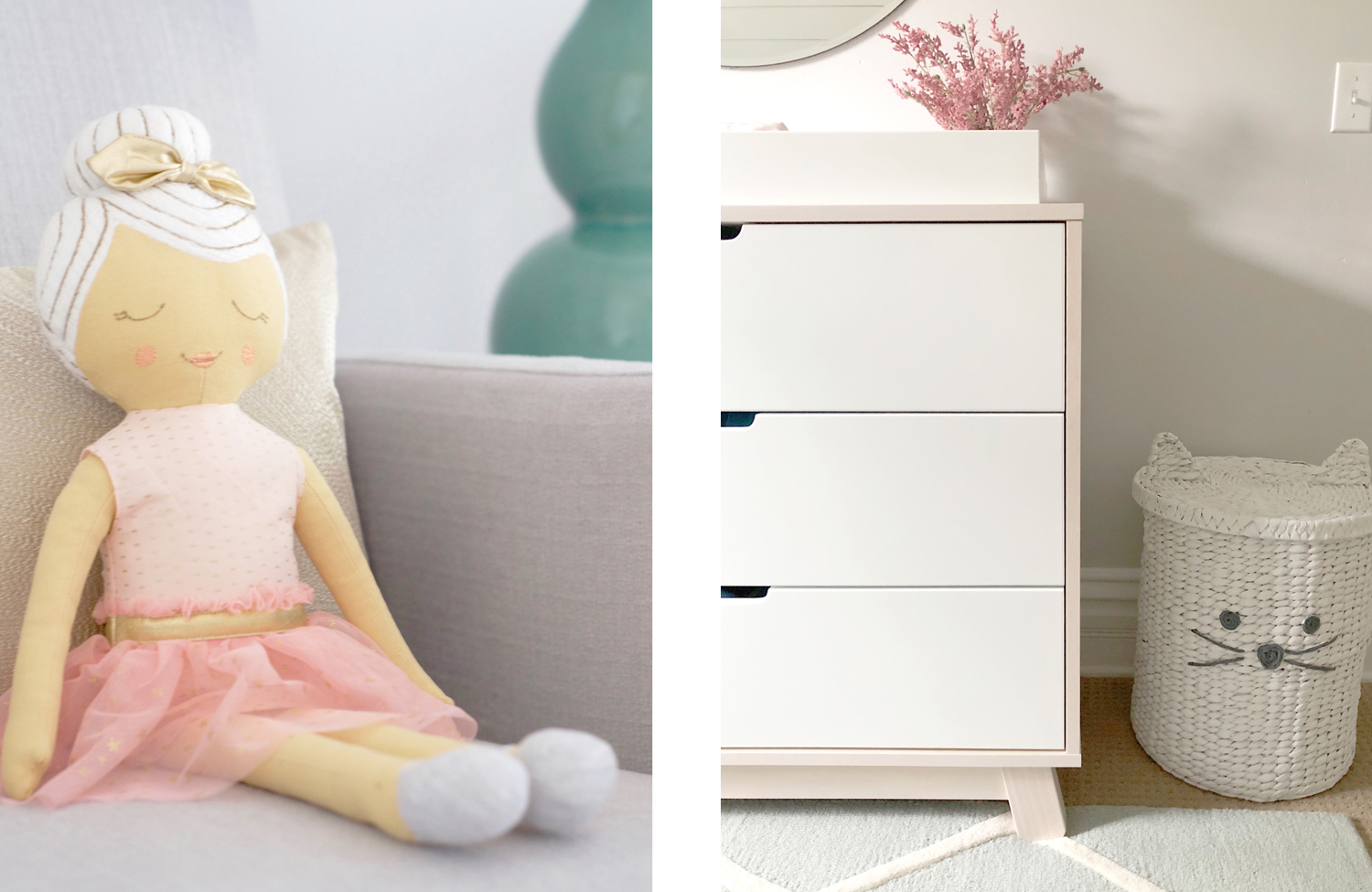
The crib and changing table were a great find, too. I always love having a natural element to a room, so the natural wood on the legs of the crib and around the perimeter of the changing table helped to warm up the coolness of the the white and gray on the walls. I found a simple coordinating nightstand that worked perfectly for a lamp and clock - two new mommy essentials... ranking only slightly below a rocking chair and an ottoman. #amiright
The rest of the room came together with the accessories... they're always the cherry on top! One of my favorite tricks in every project I complete is mixing high-end accessories with low-end accessories - or rather some expensive accessories with some cheap ones. :) Accessories add up really quickly, so it's nice to throw in a few finds from Target, Hobby Lobby, and HomeGoods. For most eyes, it becomes impossible to pick out what was expensive and what was not. By mixing the two, all of the accessories in the room are elevated. It's like a magic trick.
In tradition, for my own viewing pleasure and yours... here is the before and after.
Ahh... my job is so rewarding. And not just in a materialistic way. It feels so good to make people happy - especially repeat customers like these that I have grown to know and love. I couldn't be more excited that they have added one more to their nest, and I feel so honored they trusted me to play a small role in it. Thank you, Blairs!


